Overhauled Faculty Website With Useful and Timely Info
Timeline: 1 year and 3 months, 2017
Research, Design, Frontend Development, User Experience Design, Information Architecture and Accessibility
I collaborated with a group of faculty and administrators to overhaul the old website with new and usable content.
My Role
I was originally the web designer and frontend developer. However, as the project progressed, my responsibilities expanded to include information architecture and user experience design.
Project Brief
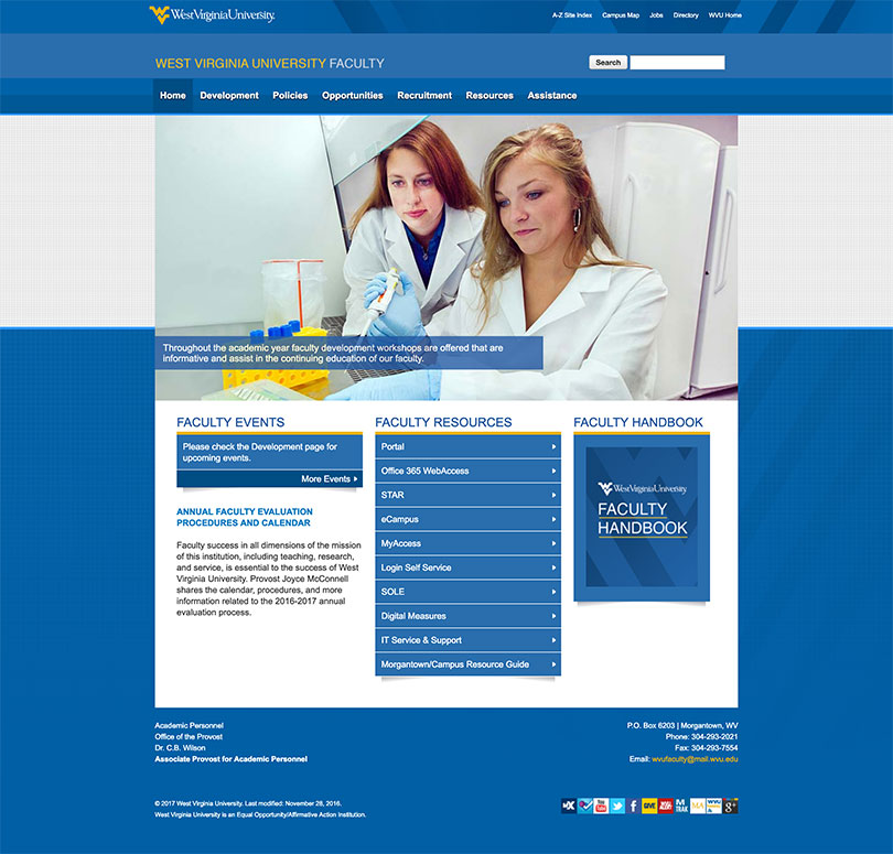
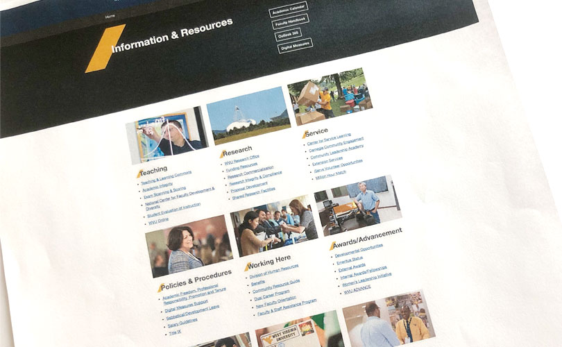
The Office of the Provost at West Virginia University needed a new faculty website that could serve as an important resource with instructional, technological, and professional development information. The existing website was a document warehouse with redundant and outdated content. Findability became an issue. Not only was the site built in an old content management system (CMS), it did not adhere to university branding. The site was also not mobile friendly.
A 15-person working group, consisted of faculty and administrators, was tasked to overhaul the website with new and usable content. The site would be built with the latest CMS that included new university branding.
User Research
Stakeholder Interviews
Because the working group consists of stakeholders from different departments, I felt that it was necessary to get their individual thoughts on how this site should function. So, at our initial meeting, the following questions were asked:
- What is the goal of this site?
- What are the objectives?
- Who is your primary/secondary/tertiary audience?
- Any feedback from faculty members about pain points when using the current site?
- What do you think are the important tasks faculty members would want to accomplish?
During this exercise, I learned that the goal and objectives were different among the stakeholders, and that the needs of faculty members changed over time, depending on the number of years they had been employed.
Proto-Personas
I asked the group to share what they wished they had known when they got hired. From their experience, I created user stories and the following three proto-personas:
- Sarah Sherwood is a faculty member for less than one year. Being new to the university, she needs assistance in creating online courses, evaluating her students’ performance and checking course information. She is also interested in professional development opportunities.
- Tim Brandon is an associate professor with 8 years of service and is a member of the faculty senate. He is an active volunteer in the community. Due for a promotion, he wants to know the evaluation criteria and the deadline for submitting the required document.
- Li Ming is interested in working as a faculty member and researcher. He wants to know the expectations of teaching at the university and funding resources for his research in nanotechnology. He also wants to know benefits and compensation, and what it’s like to be living in Morgantown.
Card Sorting
Card sorting was carried out by the working group to validate the organization, structure and labelling of the existing site. This also gave us the opportunity to improve navigation, rename categories and bring important tasks that were buried three levels deep to the homepage.
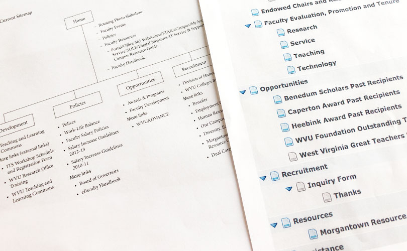
Content Audit and Information Architecture
Based on the data I gathered, I conducted a top-to-bottom inventory of existing content to eliminate redundant and duplicated pages, and added new ones to fill gaps in information. Collaborating with a copy editor, we reorganized and prioritized existing content, and streamlined workflow. Because our users came to this site for a specific goal, we used the Top Task methodology to help them accomplish their task faster and get out of their way.
Design and Development
Prototype
I created a quick prototype of the new site to gather feedback from the working group. This proved to be effective because it gave them a good idea of the functionality and user journey, and identified areas for improvement. This was also an opportunity to ensure everyone was on the same page.
Frontend Development
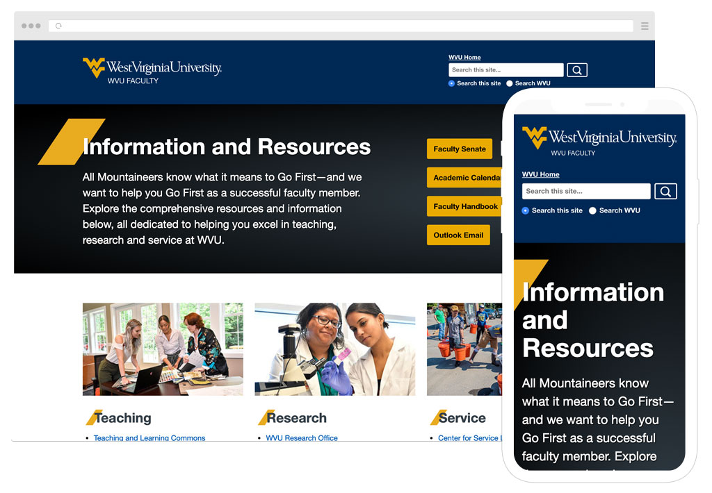
Once everyone signed off on the prototype, I proceeded to build the site in the new CMS. With the mobile-first approach in mind, I made sure the site delivered the right user experience regardless of what devices were used. During production, I ran into an issue of lengthy headers for some categories but I was able to quickly resolve it by contacting the copy editor. I also performed optimization on the site so that it would load quickly.
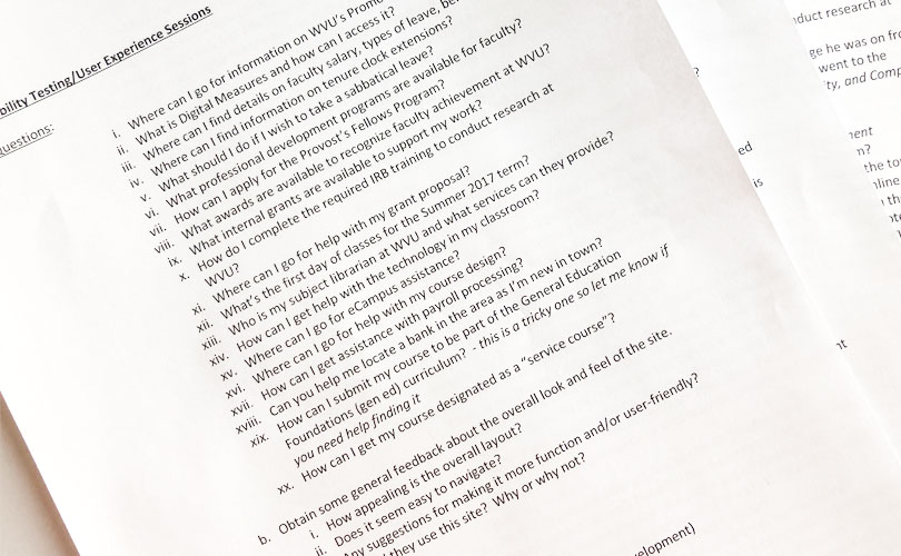
Usability Test
Another member in the working group recruited faculty members to perform a set of tasks on the redesigned site. I was present to observe that some members failed certain tasks because either categories were not properly named or terminologies were misinterpreted.
It was eye-opening to see the confusion on their faces when they encountered problems and got stuck. Changes were made to the site based on the results of the usability test.
Accessibility
Because the university is a higher education institution, we needed to comply with Section 504 of the Rehabilitation Act of 1973 and Title II of the Americans with Disabilities Act of 1990. Not only that, it was also the right thing to do.
I worked with the content publishers on accessibility guidelines and how to write for the web.
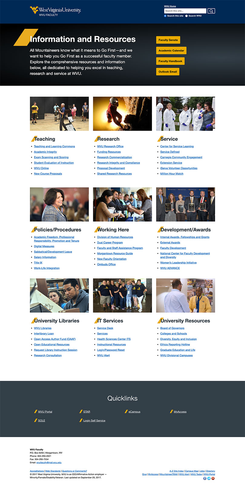
Result
The site was launched after over a year of planning and discussions. In the first two months, mobile device engagement went up by 15%. It was well-received because faculty commented about how tasks were now grouped together logically, making information easy to find.
Although the site is live, the job is not finished. The site administrator is constantly monitoring the needs of the users via Google Analytics and user feedback, and then make necessary changes.