Refining Account Claiming With The RITE Method
Timeline: 2 weeks, 2019
Usability Test, Design, Frontend Development, User Experience Design, UX Writing and Accessibility
I worked in a team of five to improve the current self-service website and refine the new account claiming process.
My Role
My team included a product manager, a project manager, a communication specialist and a backend developer. I was initially the UX designer but later, I was tasked with the frontend development as well because the backend developer had other responsibilities in this project. (“Just roll with it,” said the project manager). I also edited content on the project.
Project Brief
The self-service site that managed employee and student login credentials needed to be updated because the University had switched to another external identity management service, which uses the SaaS model.
During the kickoff meeting, the product manager indicated that the goal was to create an MVP (minimum viable product) site for testing in three weeks. To meet this quick turnaround, it was decided that the look-and-feel would remain the same and efforts should be spent on streamlining account management workflows while simplifying content with clear and plain language. We also had to integrate the current Security Statement and Cybersecurity Quiz into the claiming process.
My Process
Product Discovery
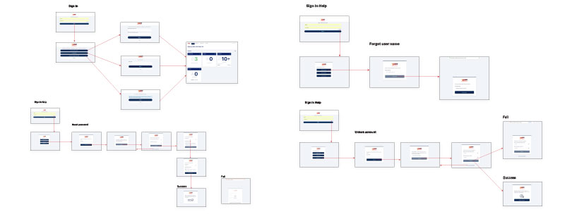
I created user flows to understand the new account management system and spot potential pain points. One of them was after users finished registering their account, instead of creating a password, they were taken to the vendor’s login page. So, to guide them through the process, we added step-by-step instructions in the registration email.
Current Site Analysis
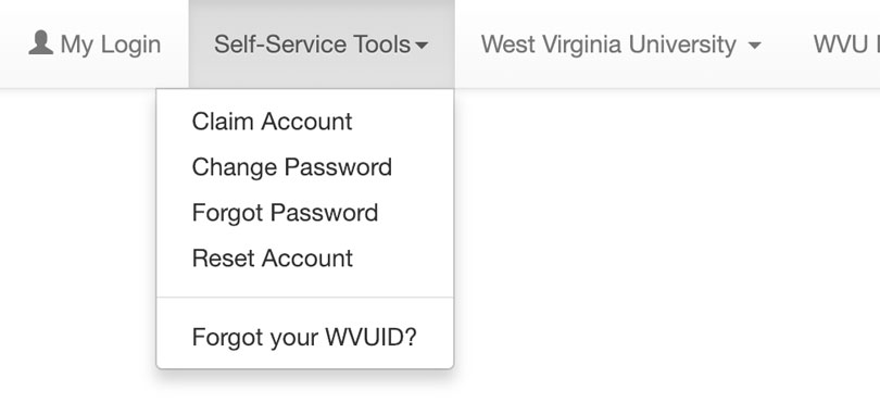
We discovered there were duplicated links that went to the same destination and important information such as how to contact Service Desk was hidden in the dropdown menu on the navigation bar. JavaScript was used for unnecessary flyout modal windows and some pages could be consolidated into a single page. The overall copy on the site sounded too technical.
Designing the New Site
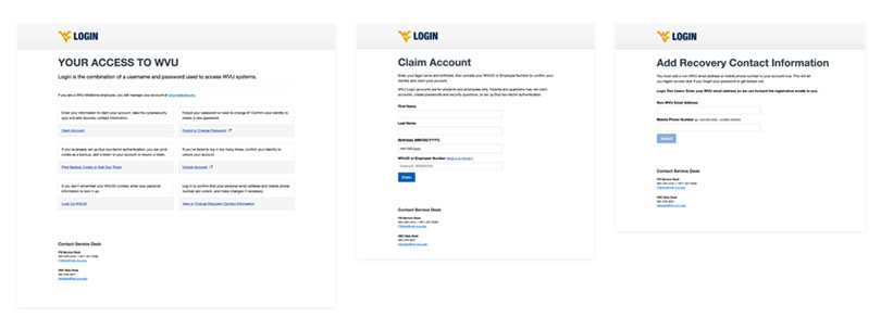
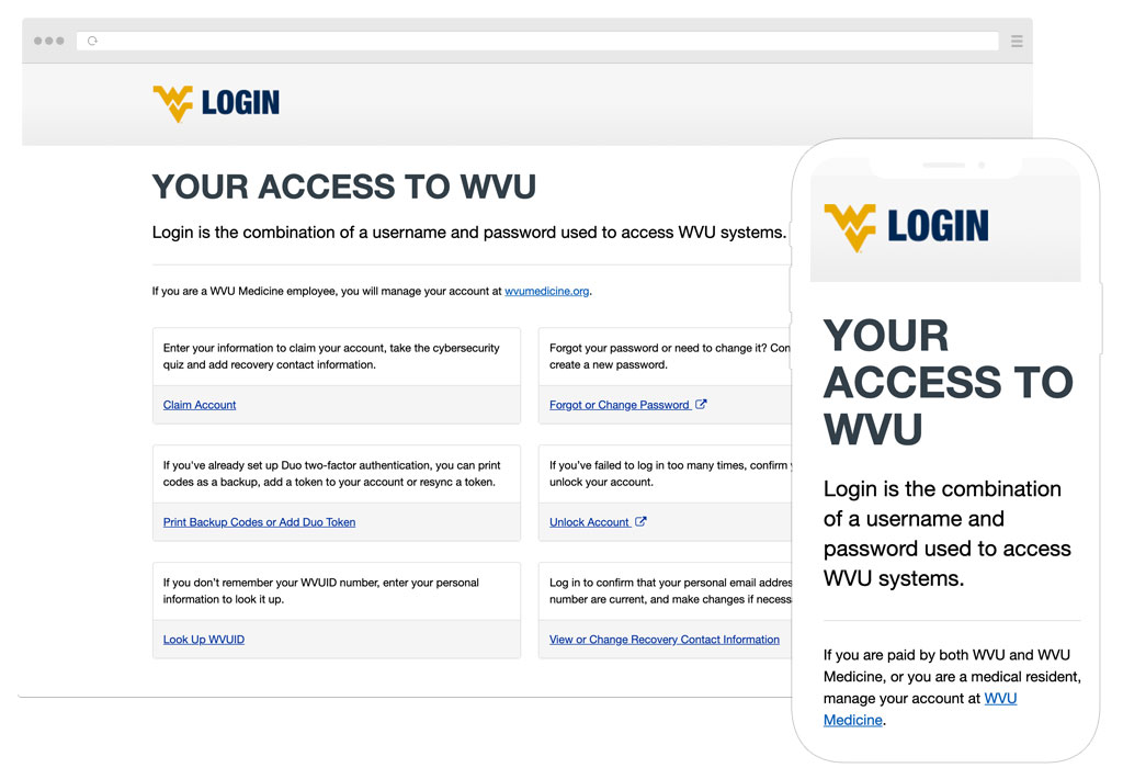
Because the main menu was cluttered with duplicated labels, the communication specialist and I removed them. We moved the Service Desk contact information to the footer of the entire site and focused on the main reasons why users came to the site: to claim new user account, to change or reset password, to print backup codes/add DUO token, and to unlock user account. We also rewrote the content to make it more conversational.
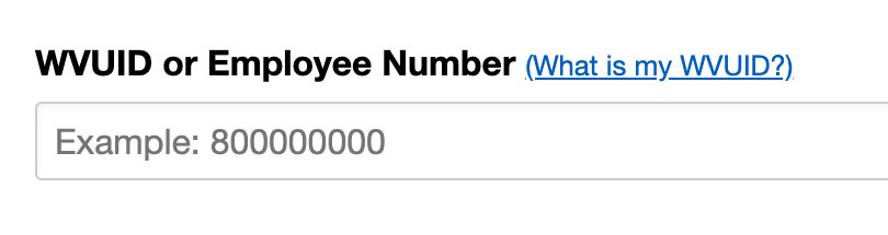
The current account claiming form asked for either a university ID or employee number as part of the verification process. Users had to first choose an ID type from the Select Menu and then entered their number in the number field.
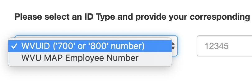
But why make them take an extra step?
So, to expedite the process and improve usability, I removed the Select Menu. Now, users only have to enter either their ID or employee number and the system will validate at the backend.

Showing Our Work Early For Feedback
We knew it was important to involve the Service Desk team early in the design phase to identity usability issues because they rely on the site to answer questions from users who need help with account problems.
Turns out by removing the main menu, we inadvertently also removed “Forgot your WVUID?” which was nested in one of the dropdown menus. This link was frequently used by the Service Desk team to help users look up their ID number for account verification. Since this was an important functionality, we restored it back on the homepage, renamed it “Look Up WVUID” and made it a core task.
Iterating with the RITE Method
Because of the time constraint to produce a working prototype, I decided to use the Rapid Iterative Testing and Evaluation, or RITE method to quickly gather feedback, iterate the design and resolve any usability issues.
To claim a new account, a user must:
- Go to the self-service site and select Claim Account
- Take cybersecurity quiz
- Enter recovery work email/alternate phone
- Wait for username and password link to arrive in her inbox
- Follow link in the email to the vendor’s site to continue claiming account
- Enter alternate phone and email
- Accept Security Responsibility Statement
- Create password
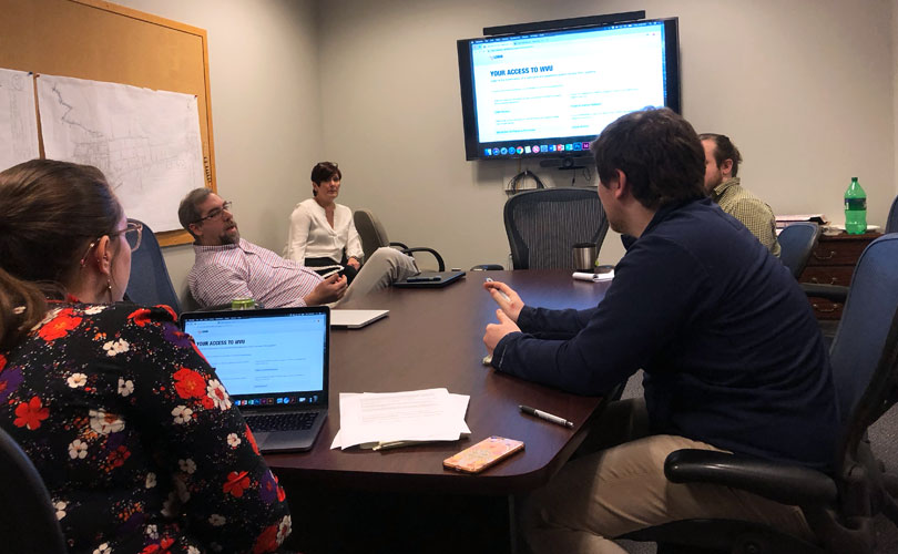
I sat down with five participants (separate sessions) in their work environment and watched them go through the process.
Problem One
Remember the potential pain point? Well, two participants were confused when they were taken to the login page after registration, validating our concern. Turned out, they didn’t read the instructions in the email. Also, while filing out their contact information, both wondered if “alternate phone” was meant to enter office phone or mobile phone.
Solution: After talking to the vendor, our team learned that we could set the redirect on our end and APIs were available for customization. The backend developer then simplified the workflow by reducing extraneous steps, creating a smoother user flow. For example, the user does not have to wait for her username and password link to arrive in her inbox to continue the claiming process. We also replaced “alternate phone” with “mobile phone” for clarity.
Now, a user:
- Goes to the self-service site to confirm identity
- Accepts Security Responsibility Statement
- Takes cybersecurity quiz
- Enters recovery personal email/mobile phone
- Stays on self-service site and follow the link to vendor’s site to continue claiming account with username
- Creates password
Problem Two
As part of the account claiming process, a user was required to provide either her ID or employee number. All three participants did not memorize either number (I did an informal survey and found out others said the same thing.) and I watched them looking in their drawer or wallet to get this information. I realized this was an opportunity to improve their user experience.
Solution: We added a “What is my WVUID?” link on the account claiming form to help users look up their ID number easily.
The Result
After multiple iterations, we completed the self-service site in two weeks (with one week to spare) and exceeded our goal. Using the RITE method was productive because we were able to identify usability issues early with the first two participants and iterate the design quickly. We could then validate our solutions with other participants and move on to resolve other issues.
The site went into production. Continual improvements were made while several demos were given at the University. Overall feedback was good with only minor language rewrites needed.